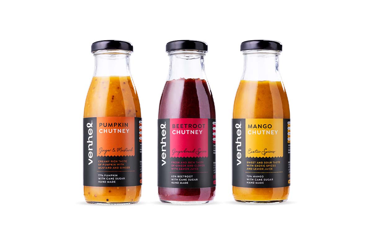
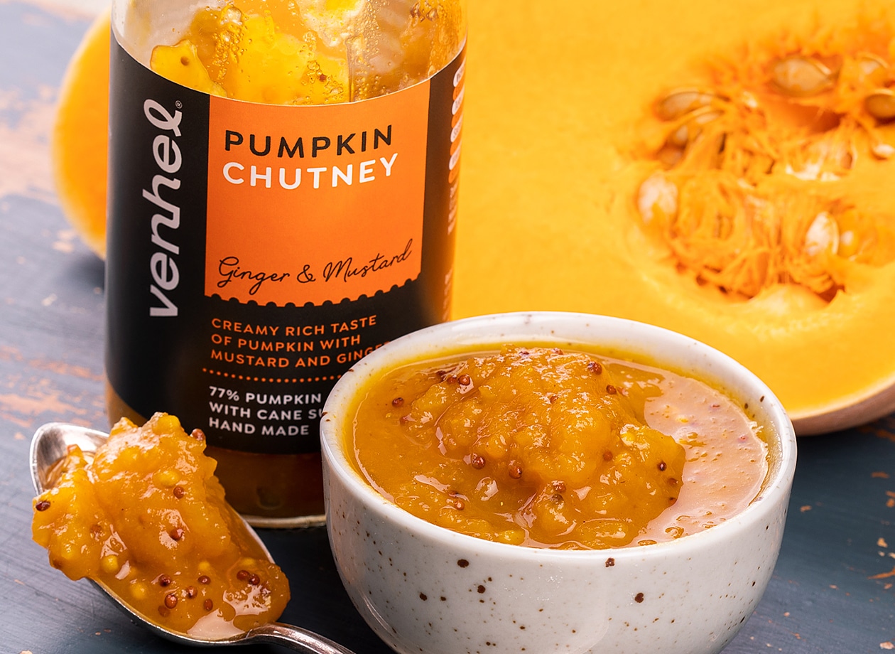
Slovakia online retailer Venhel has created an entire range of Retail Brand well-designed modern Retail Brand products. The branding created by Czech Republic agency MAISON D’IDÉE expresses an engaging personality and beautiful design
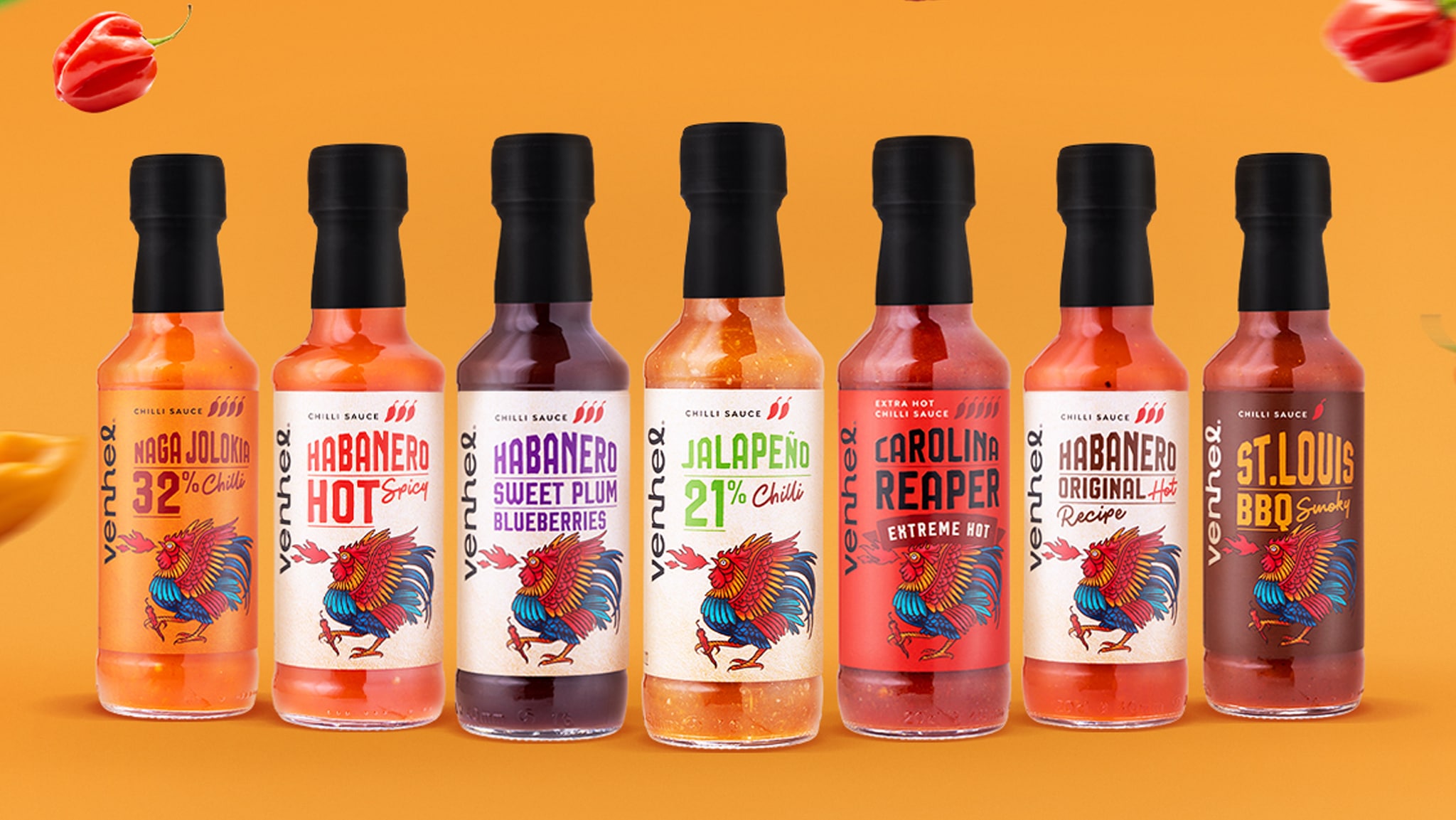
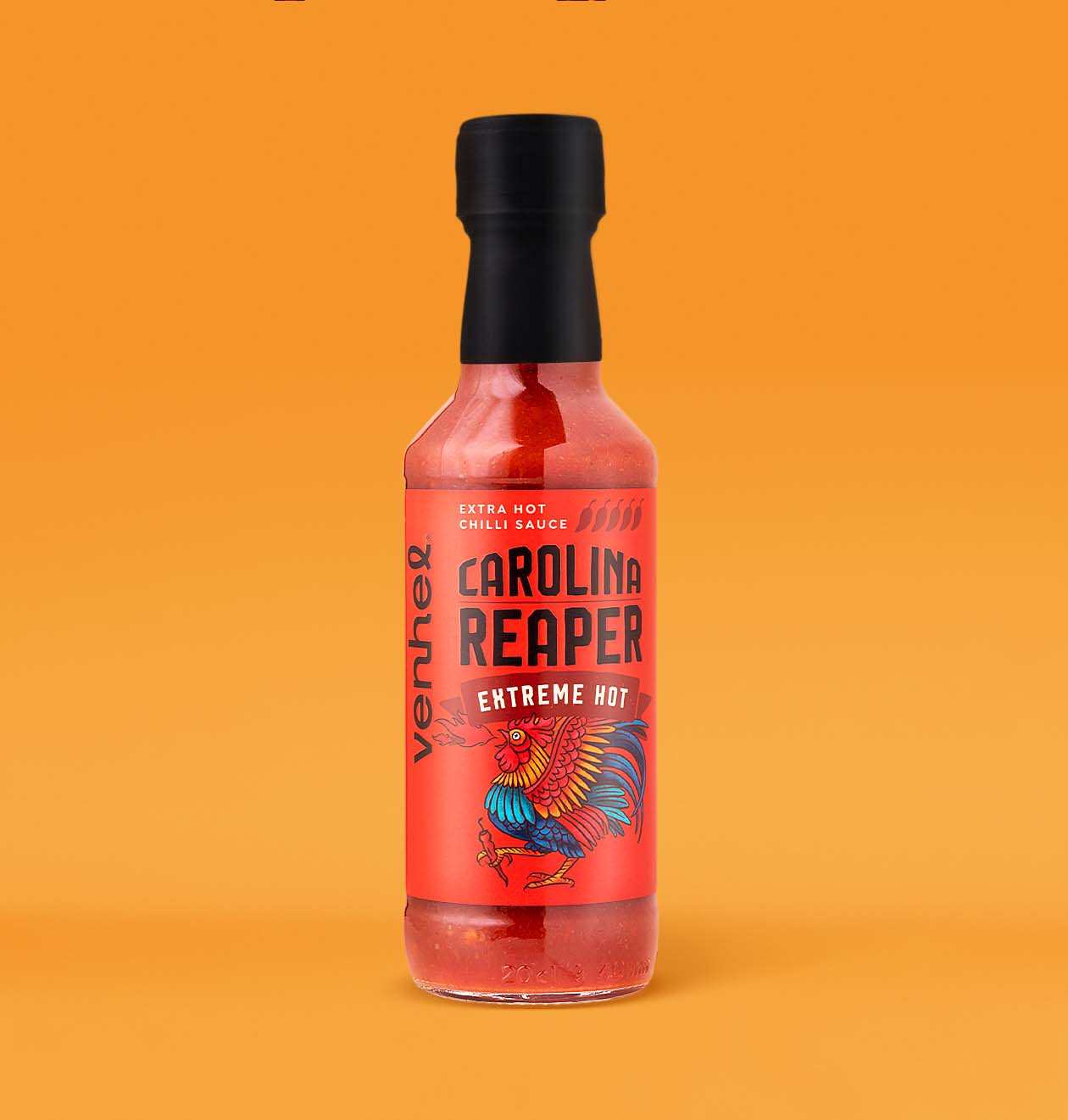
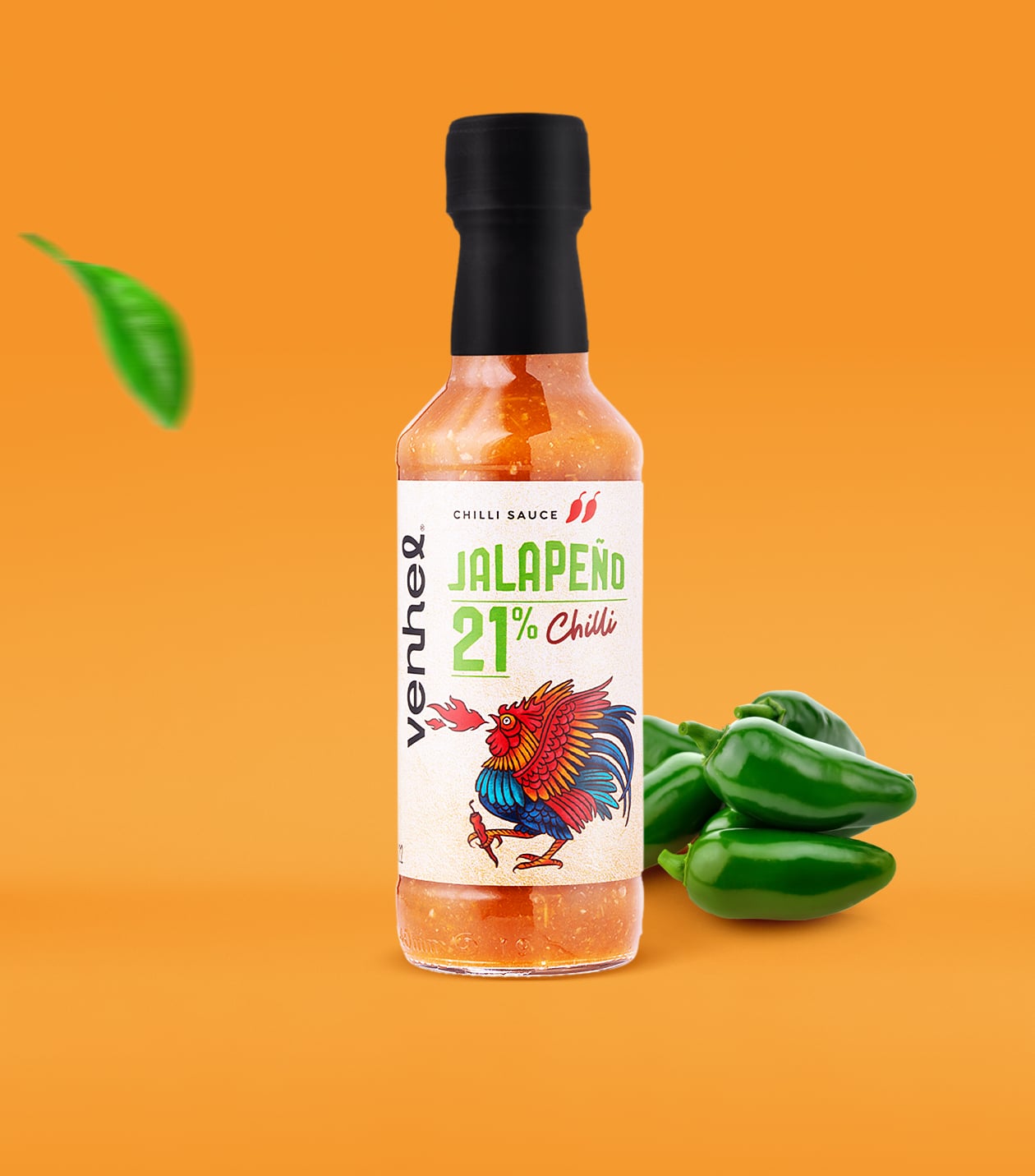
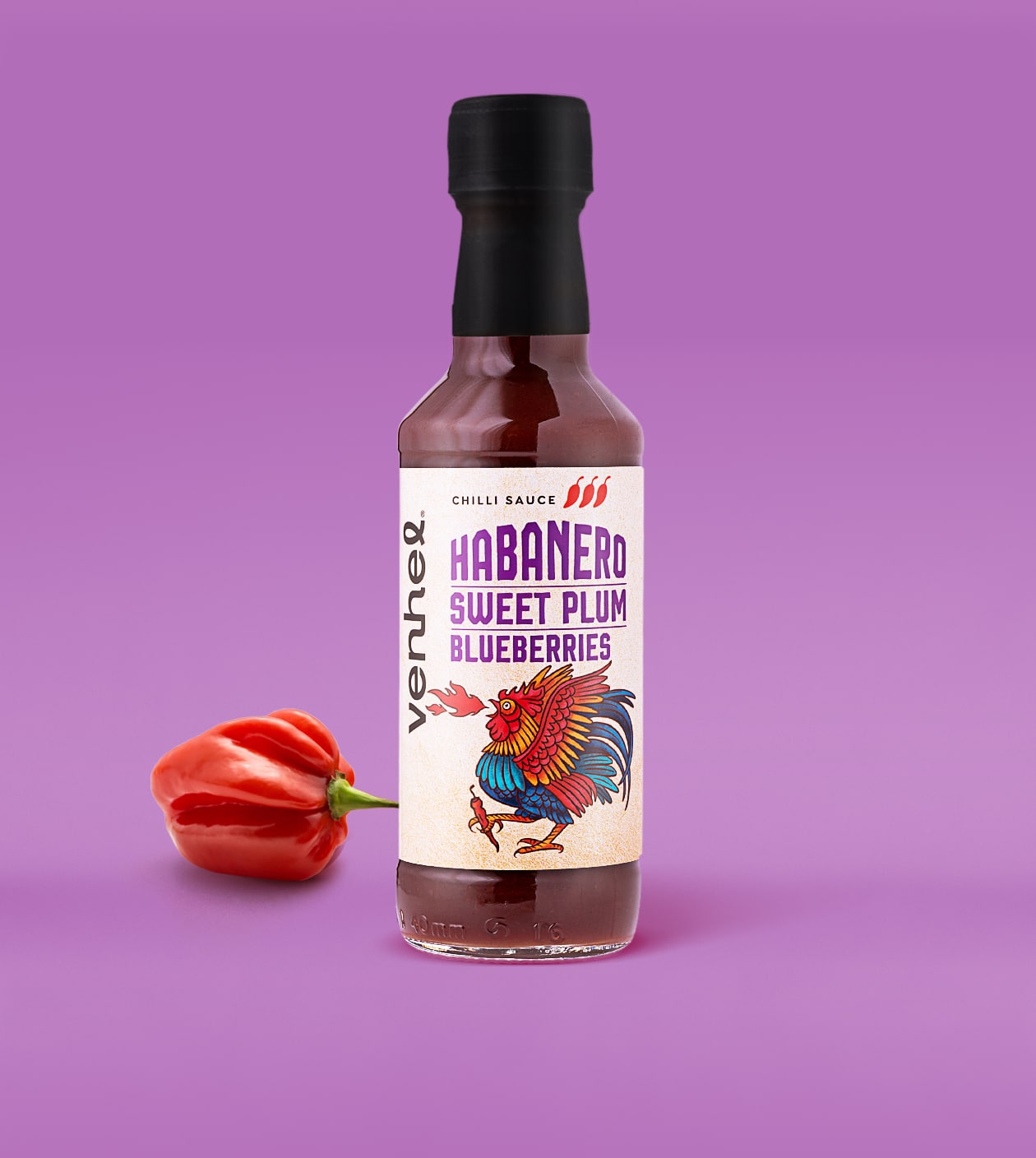
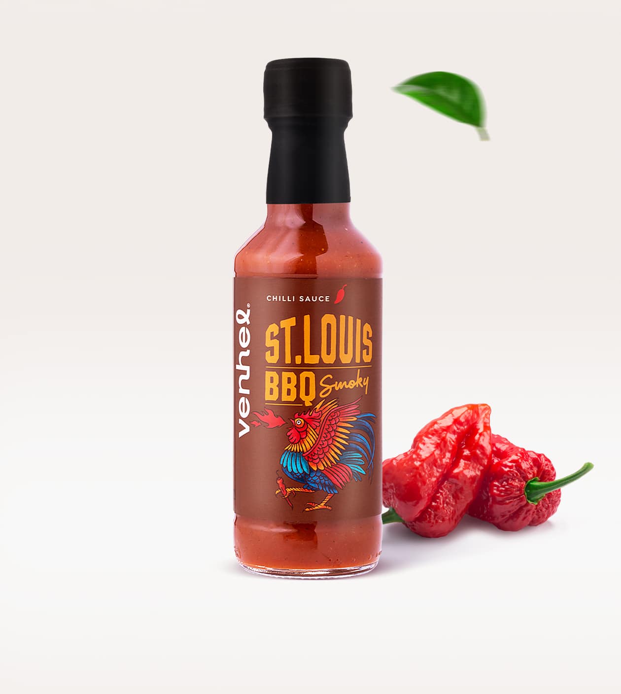
VENHEL spicy sauces
One of three product lines of chili brands.
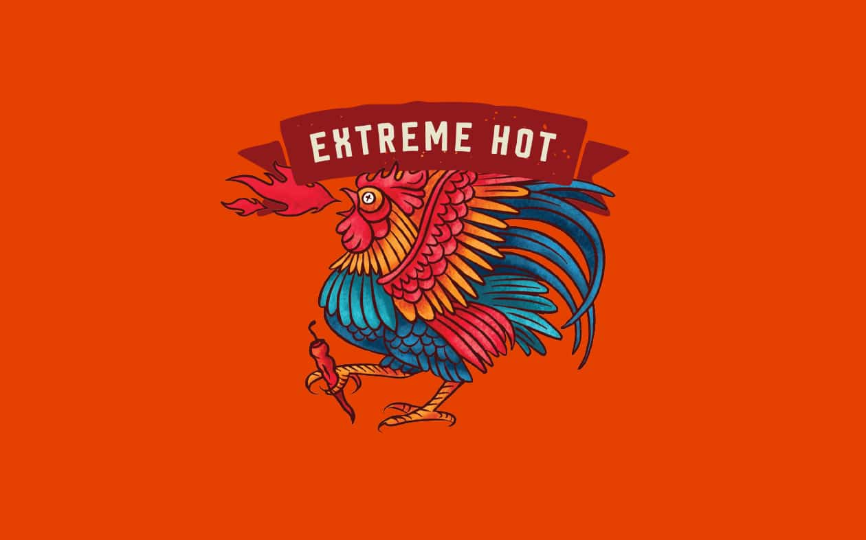
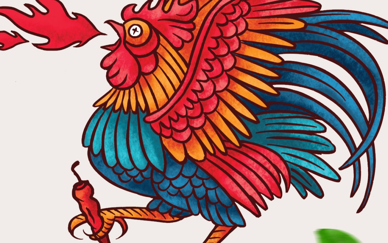
The main motif of the packaging is a beautifully illustrated rooster. The typography and logo placement draw on the VENHEL brand identity and the color palette differentiates the different chili sauces.
What’s Unique?
The rooster’s original illustration gives our packaging design an artisanal quality and authenticity.
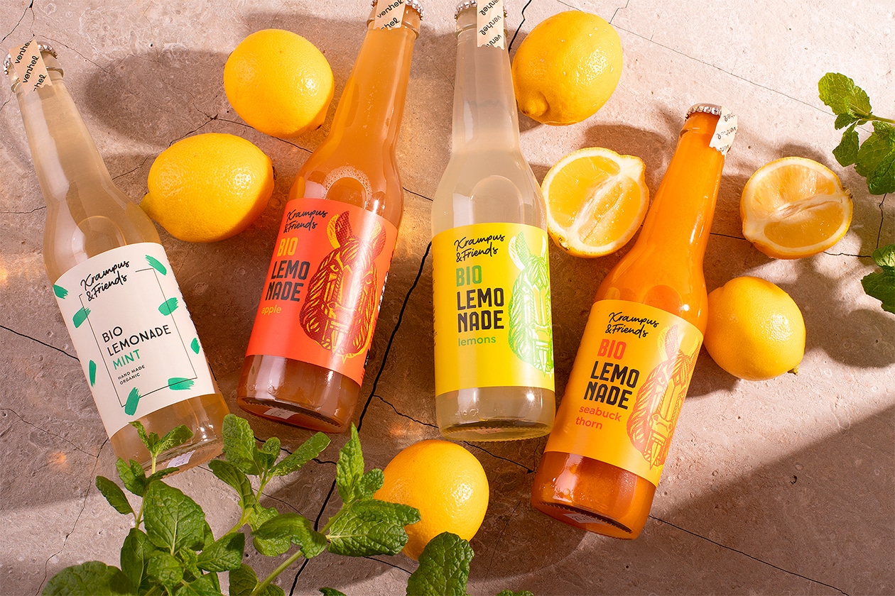
VENHEL organic lemonades
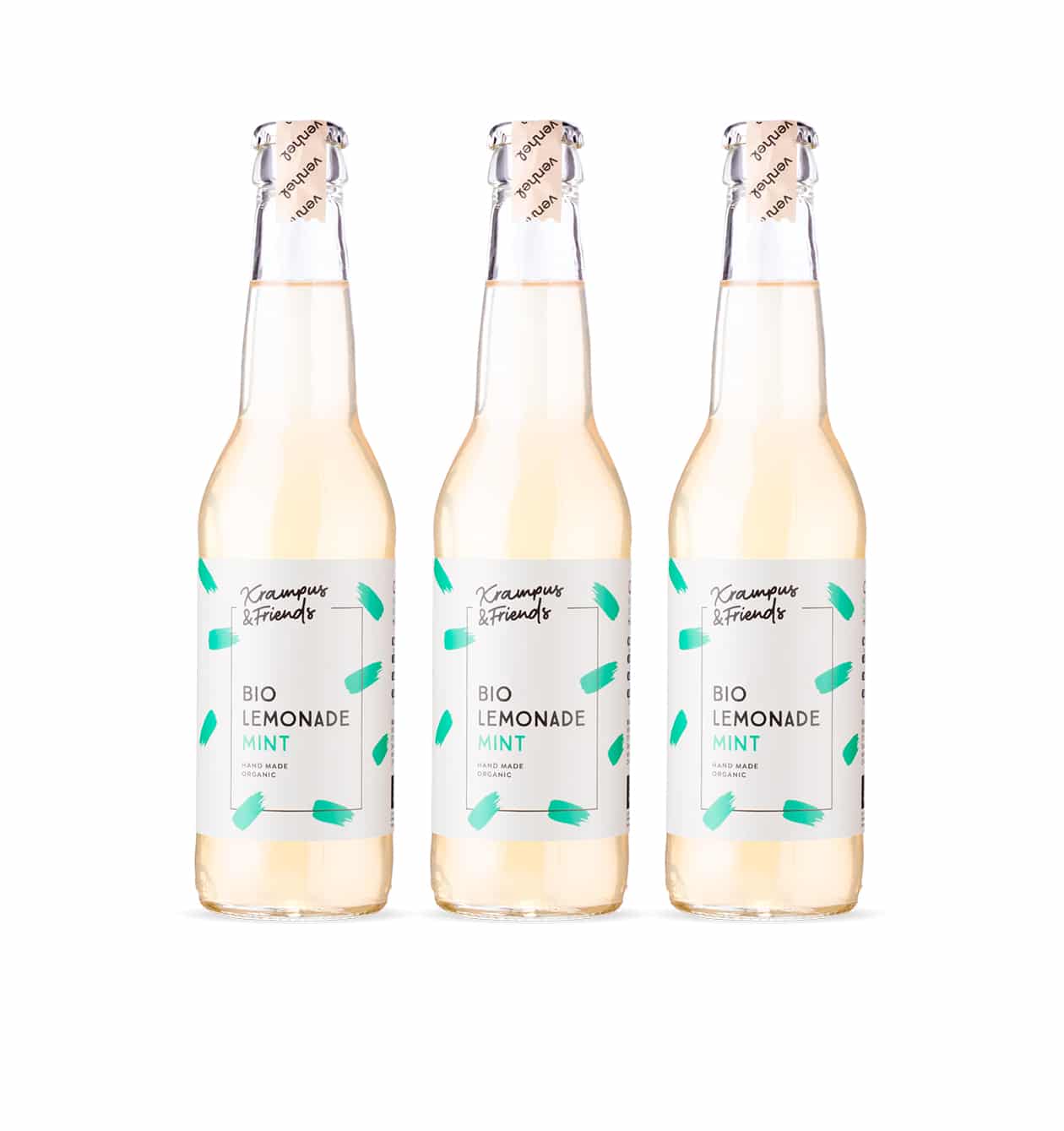
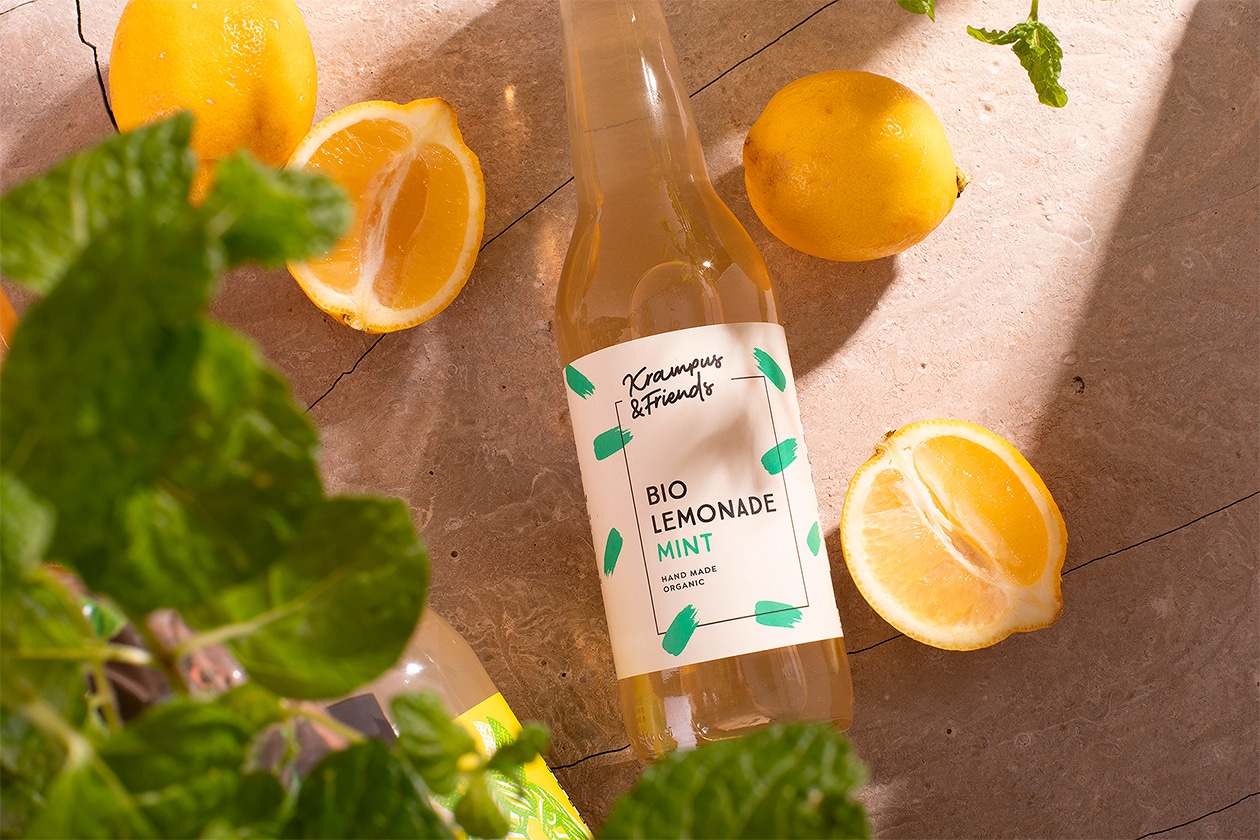
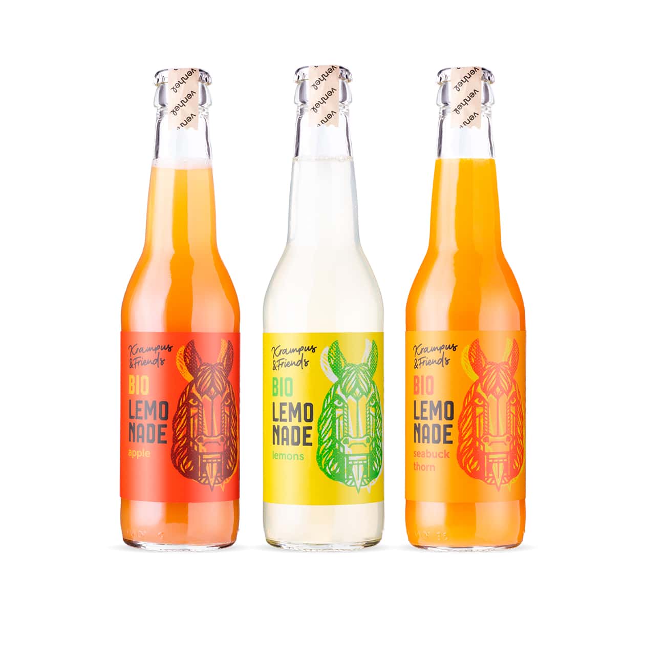
Krampus & Friends is an authentic sub-brand in VENHEL’s otherwise broad product portfolio. This little experiment has quickly gained popularity with premium and organic lemonade consumers. We had great creative freedom in choosing the visual journey of the products. We chose motifs from local folk traditions, namely a series of animal masks. We illustrated this motif ourselves and then freely interpreted it in the execution of rich and fresh colors that bring our design more into the 21st century.
What’s Unique?
Illustrated design offers the possibility of creating original, distinctive and well-registerable trademarks. Moreover, it adds a hallmark of traditionally crafted graphic practices to otherwise overly digitized graphics. The detail of the application of the illustration on the covers shows a deliberate shifting of the matrix, as a reference to traditional printing practices in graphic design studios.
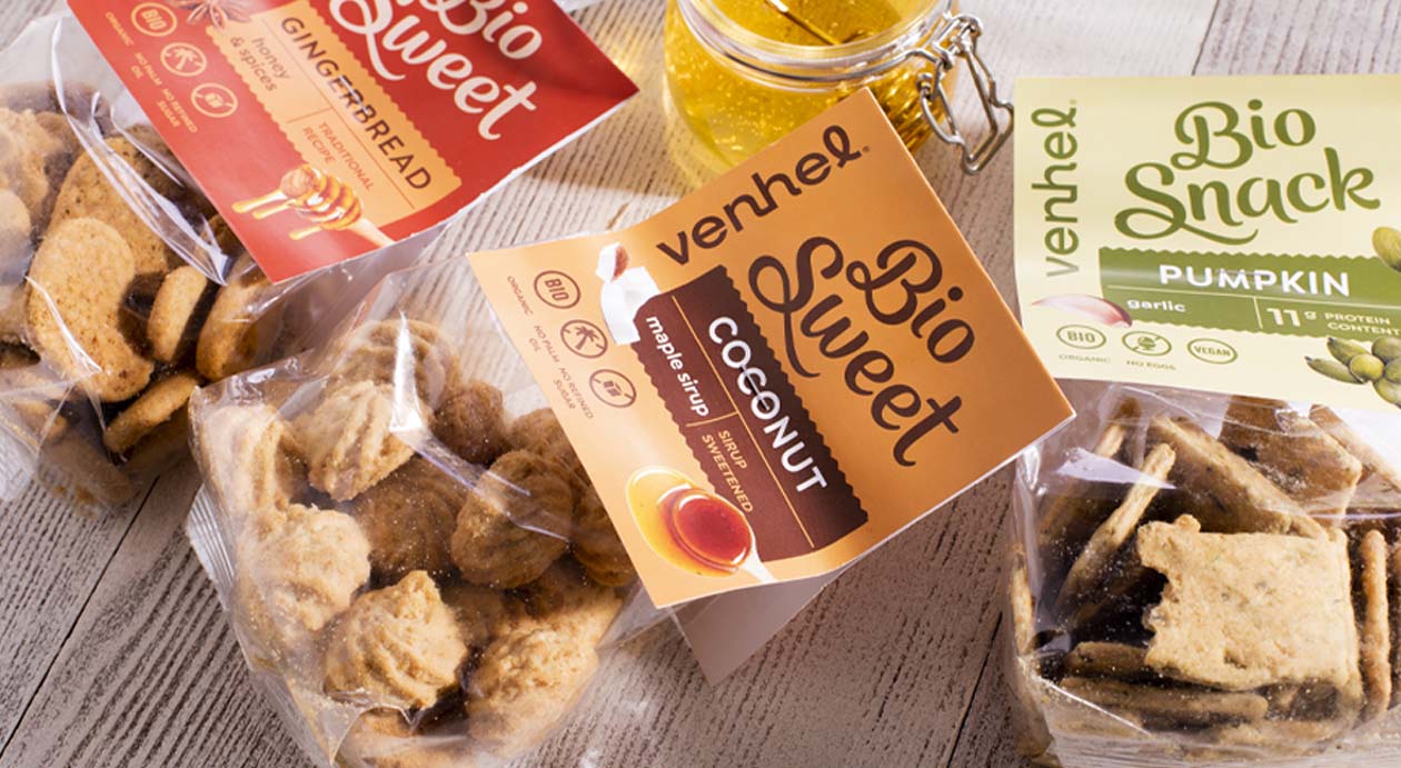
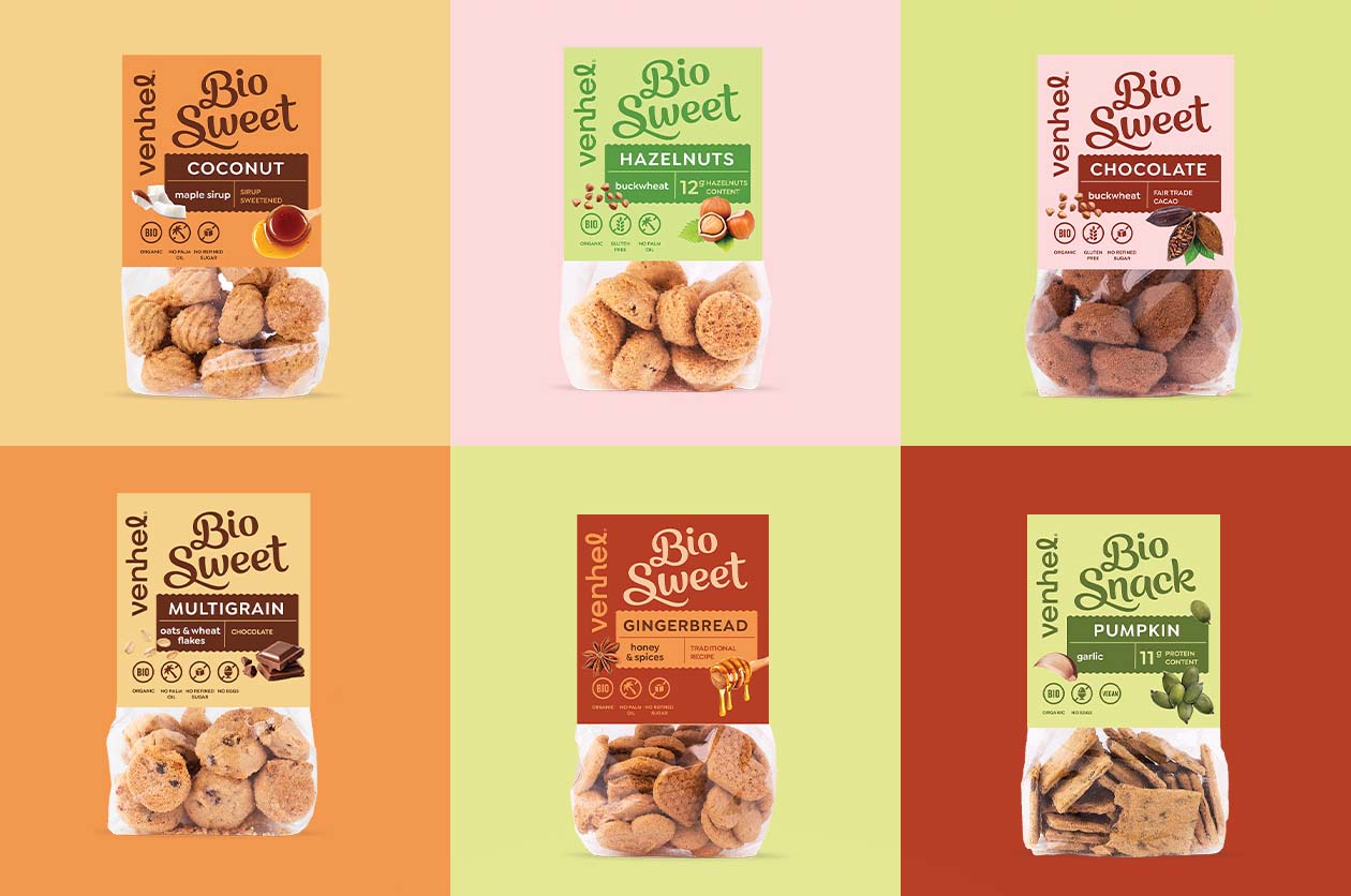
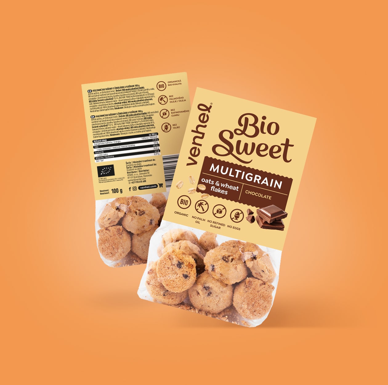
VENHEL biscuits
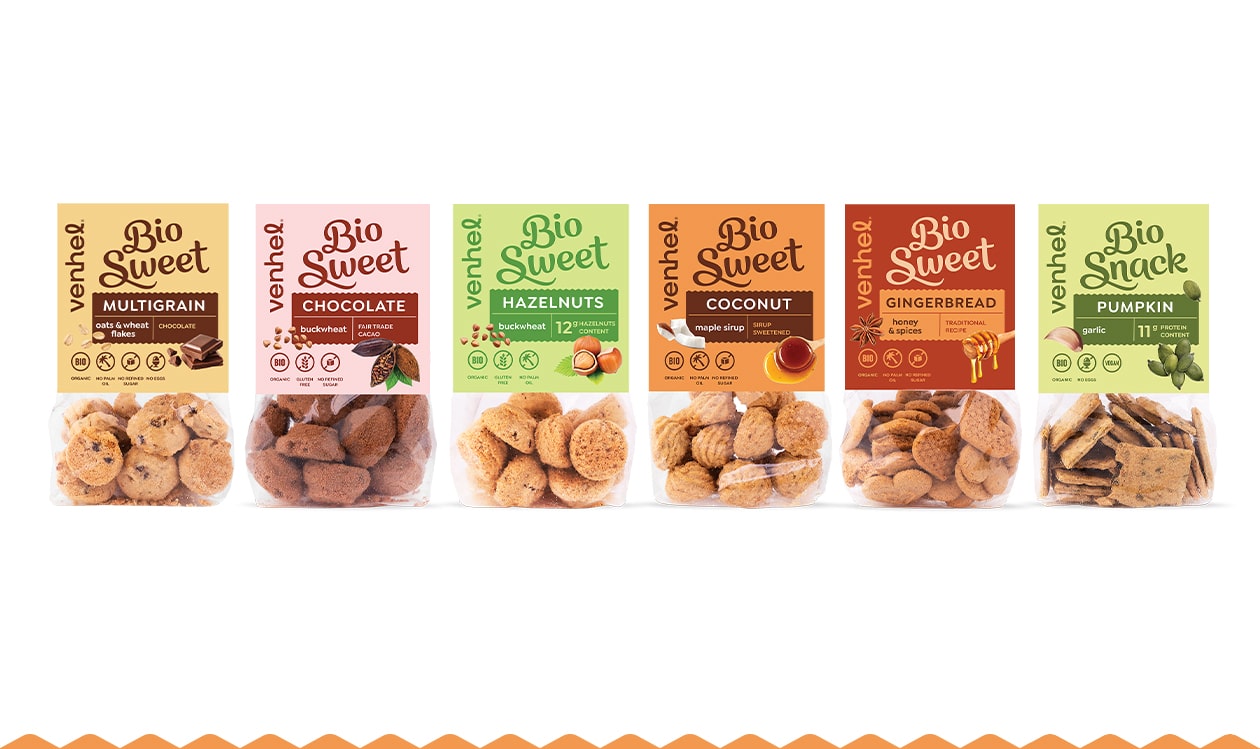
When the team created the packaging design for the tasty organic private brand biscuits, we tried to take the simplest route possible. We wanted the design to feel current while referencing the traditional approach to graphics in this segment. This way, consumers can enjoy their favorite biscuits and crackers with the sense of reward that comes with them.
What’s Unique?
The segmentation for BIO is less noticeable and becomes part of the tasty typography in the logo. The organic origin of almost all ingredients and the absence of many typical allergens are a given with such a high-quality product.
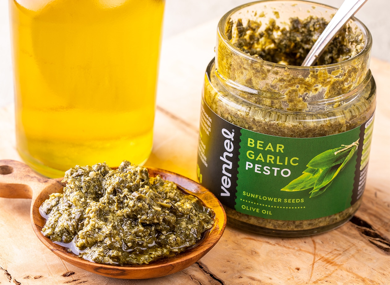
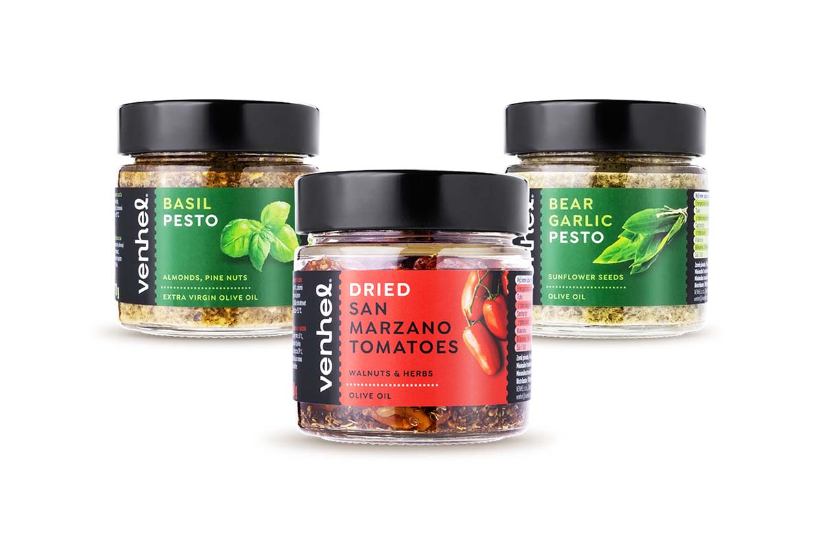
VENHEL pesto
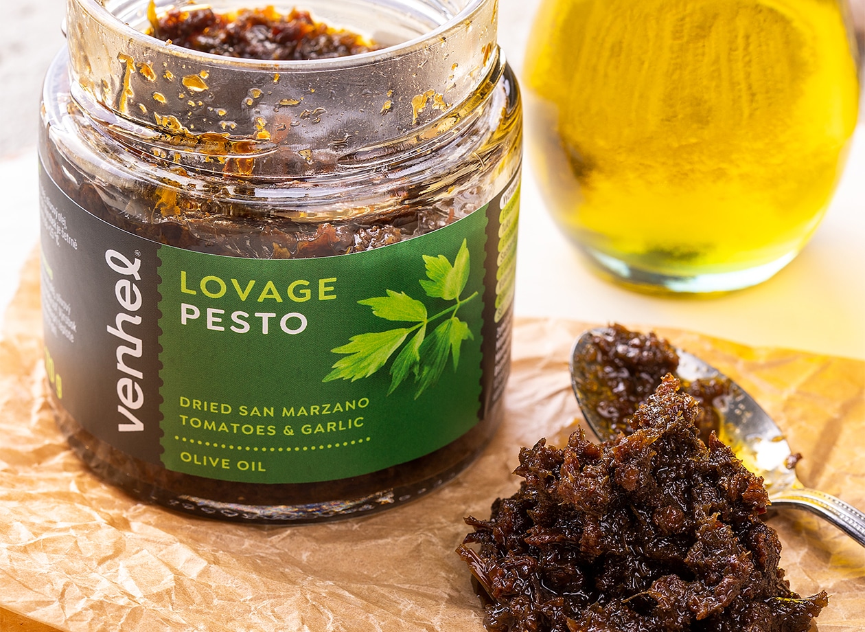
Packaging for VENHEL pesto was created as a standalone series of graphics. The team built the visual style on the already existing identity of the project. The labels are complemented by a photo of the ingredients to facilitate consumer navigation.
What’s Unique?
Thanks to digital printing, the design achieved a flexible solution for the project, ideal for hand production of small batches of products.
Related Incites
2025 EVENTS
TICKETS, SPONSORSHIPS & EXPO BOOTHS NOW AVAILABLE


