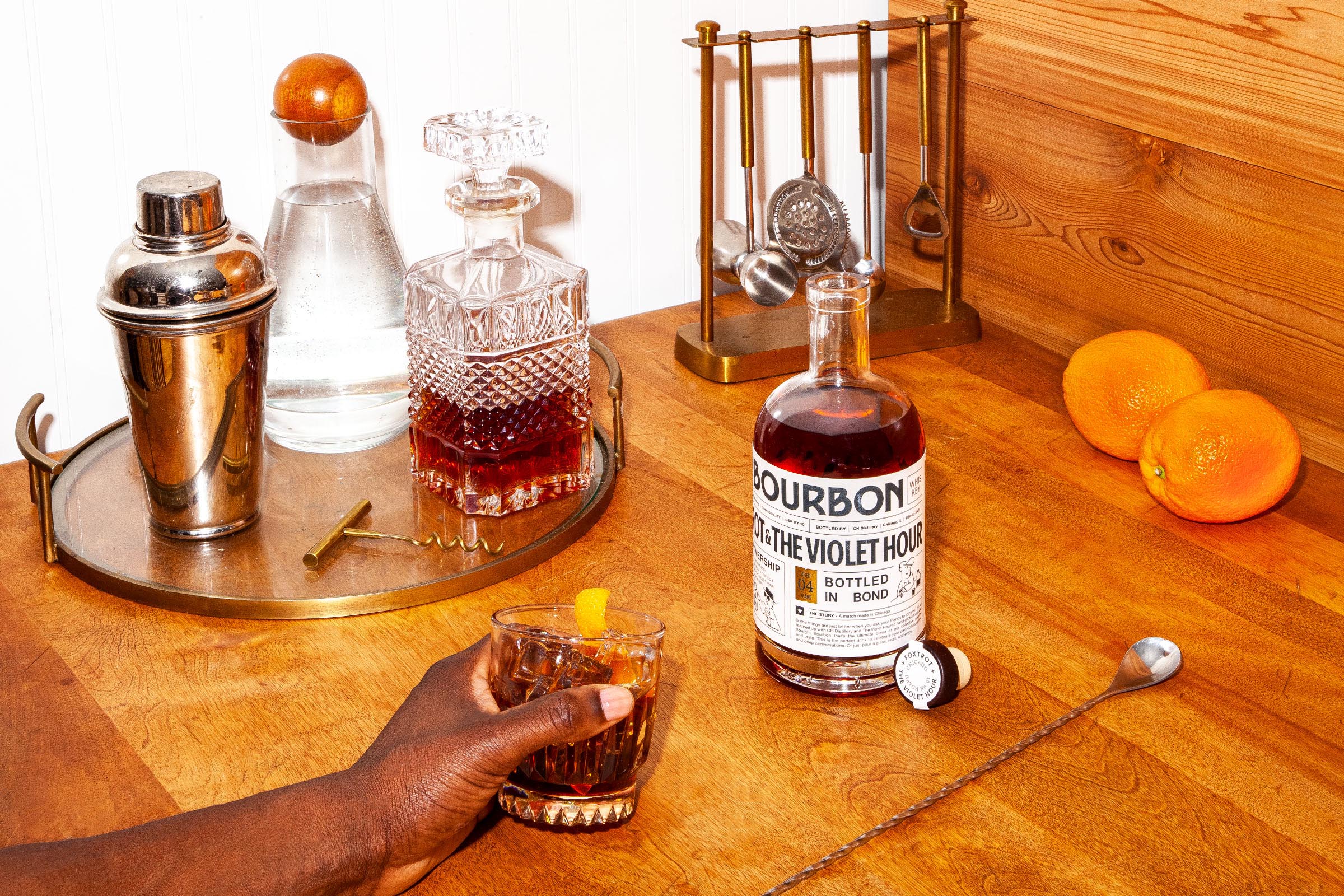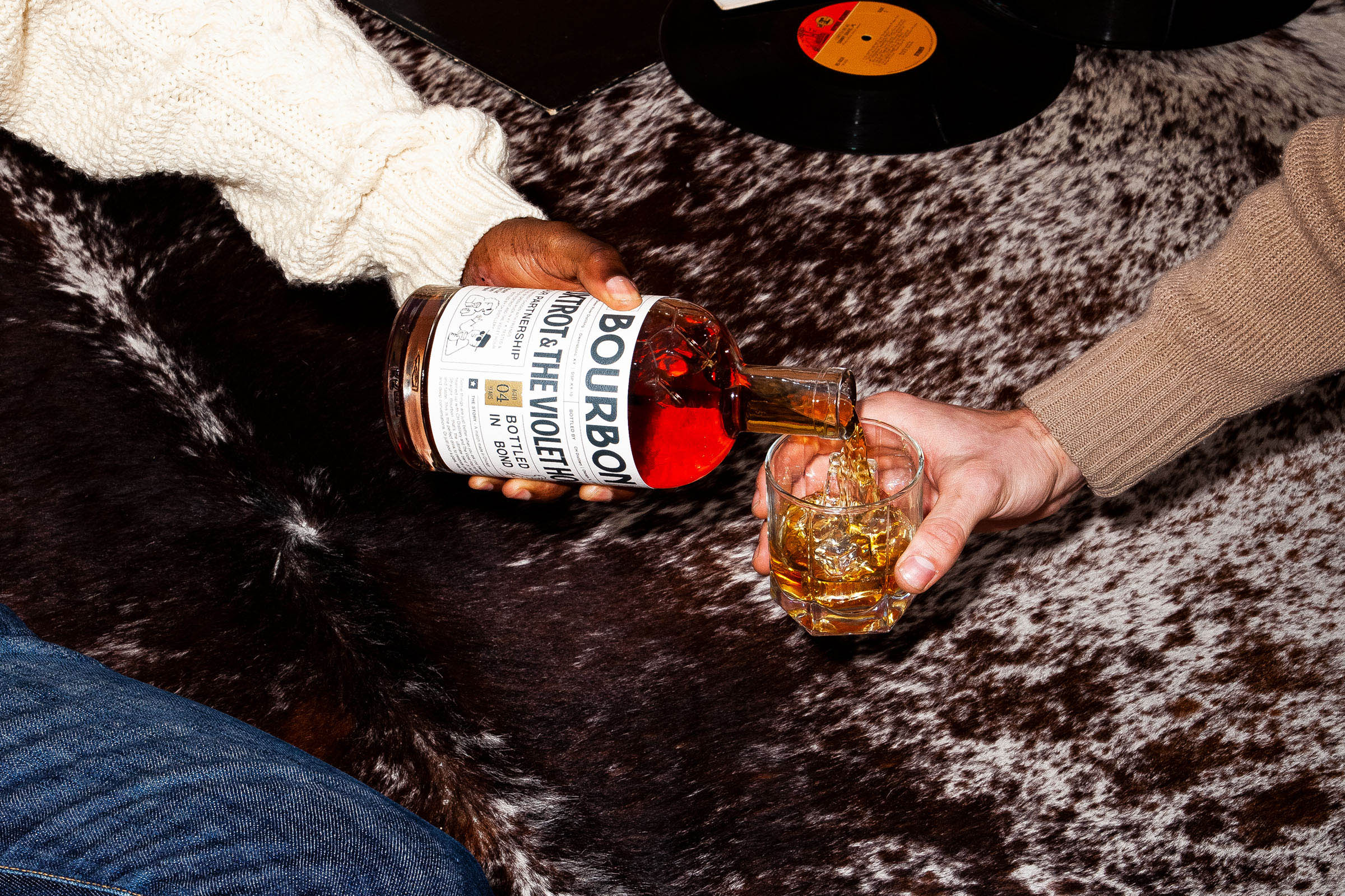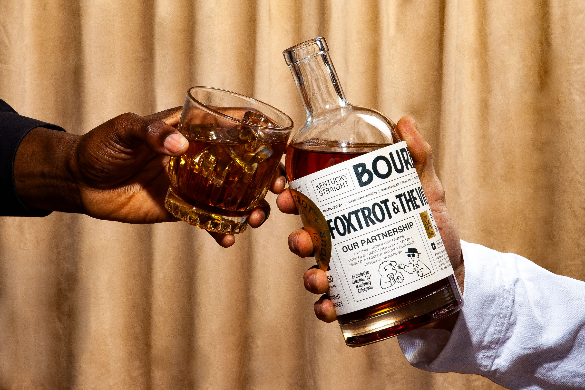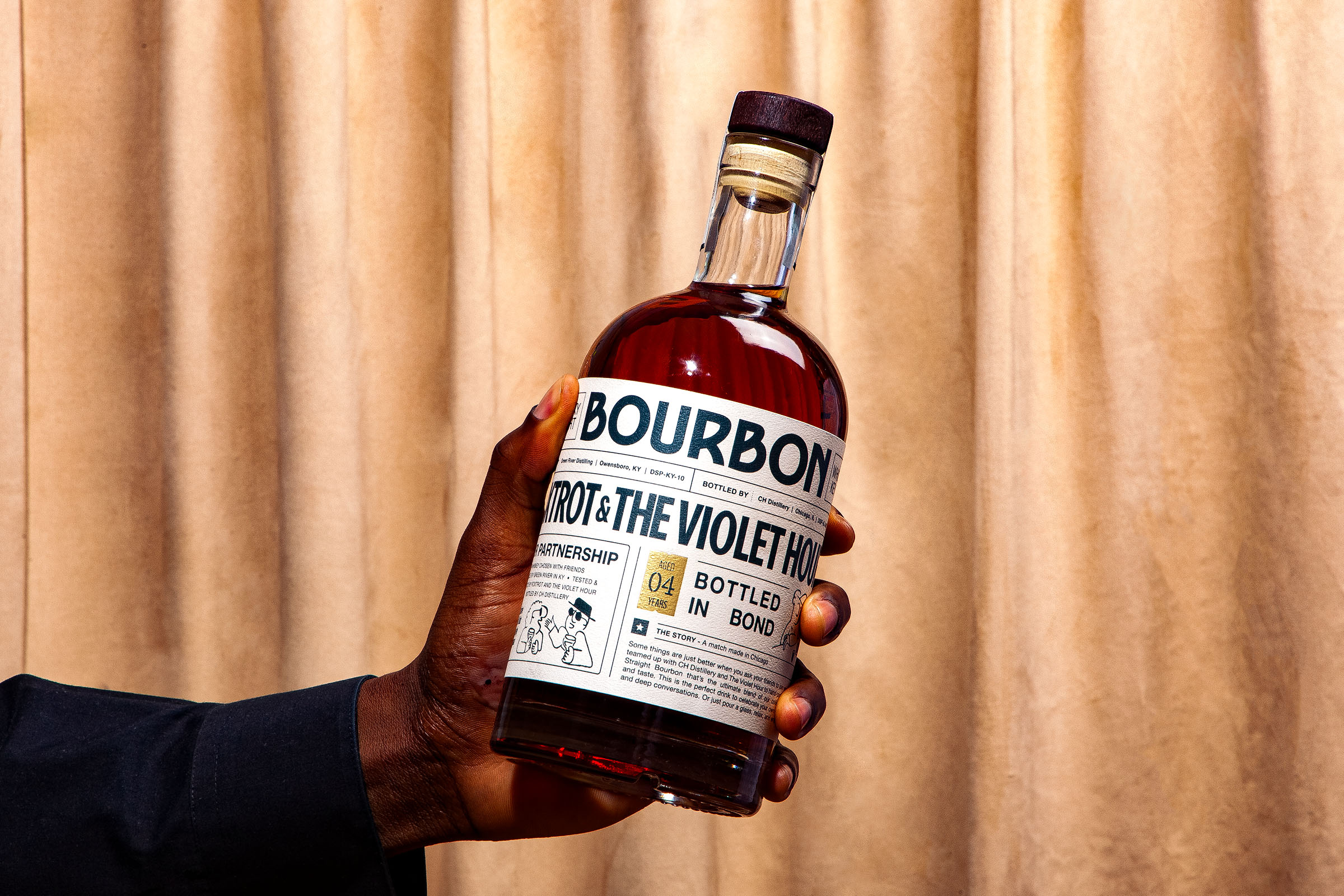
Foxtrot, a modern evolution of the classic corner store, grows its Retail Brand range with the introduction of this special edition Kentucky straight bourbon whiskey. Together with the expertise of The Violet Hour cocktail lounge, they selected 10 barrels to fashion their own, unique blend. To help tell the story of this collaborative effort, Foxtrot hired Art Director Jim Kennelly to execute the packaging design. The aim of the packaging is to tell multiple stories focusing on the Chicago-based collaboration, the unique sourcing effort, and the quality of the bourbon. The finished result is an editorial-style design solution that puts typography at the forefront and pushes the consumer to understand the product more deeply.
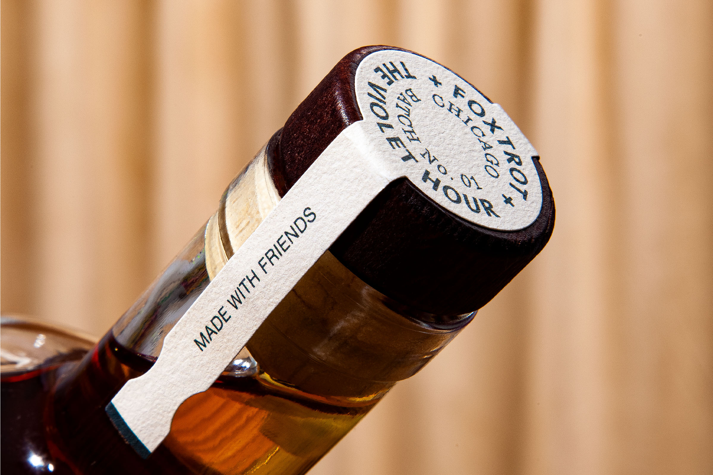
Heavily influenced by a vintage newspaper aesthetic, the private brand design pulls in quirky illustrations containing sketch artist-style characters bellied up at a bar. The idea is to position the collaboration between Foxtrot and The Violet Hour as a friendly meeting of the minds, and an almost spontaneous alliance that resulted in a brilliant product launch.
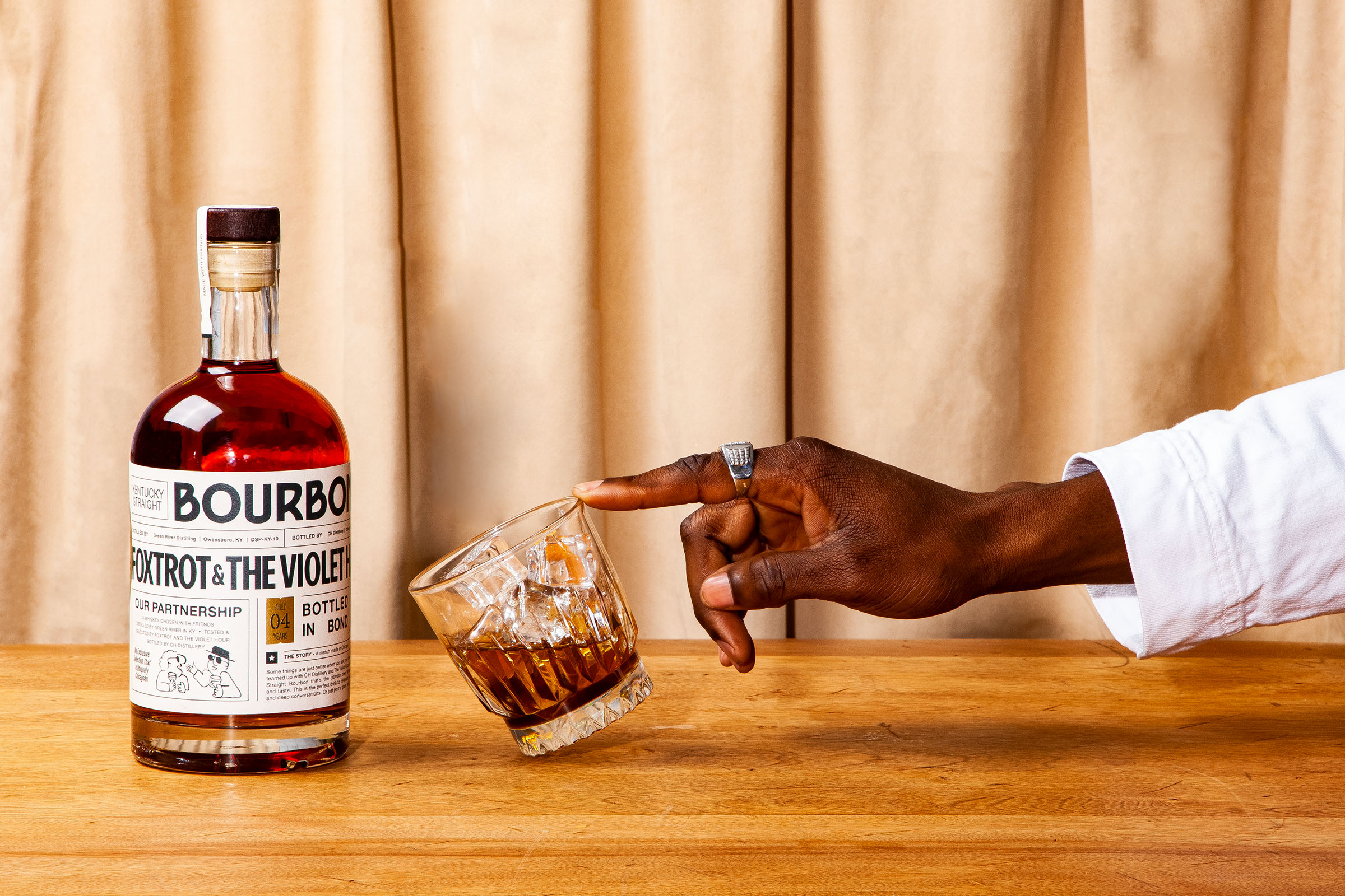
The goal with the design direction was to position this as a premium product while allowing it to not take itself too seriously. It had to feel at home on the cheery shelves of Foxtrot, as well as served under the dim lights of The Violet Hour. By Pulling together some classic “speak-easy” themed elements and combining them with a more contemporary color palette, the label helps corner a unique market. Somewhere between the casual weekend socialite, and the fine bourbon aficionado.
Related Incites
2025 EVENTS
TICKETS, SPONSORSHIPS & EXPO BOOTHS NOW AVAILABLE

