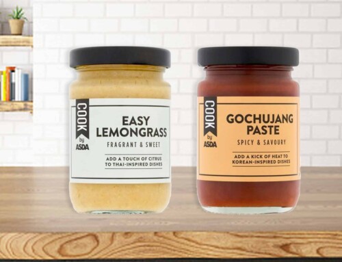
With more and more consumers choosing to cut out certain food types as well as those with intolerances that have no choice, the agency was challenged by Asda to redesign the brand to appeal to both the trust seeking “have to” consumers and the flexitarians who choose to eat free from as part of a lifestyle choice. The solution – a bold, suite of brand assets that have a cohesive look and feel, with the ability to stretch across 100+ SKUs, encompassing everything from daily essentials to Easter Eggs.
The proud, bright execution and day-lit, foody photography gives shoppers the reassurance of positive vibes, goodness, and fulfillment, making sure they never miss out or feel compromised when it comes to their food choices.
The flexible illustration style allows for flexibility to be appropriate for different categories; whether that’s Italian pasta, or valentines chocolates. This combined with the suite of bold background colors gives the brand a modern freshness that was previously lacking.
The nature of the project also meant clear allergen navigation was key, so this was brought front and center, alongside a tone of voice that offers both positivity and reassurance.
Combined these assets effectively allow for appropriate differentiation across SKUs and categories, living and breathing the “no compromise” sentiment.
Related Incites
2025 EVENTS
TICKETS, SPONSORSHIPS & EXPO BOOTHS NOW AVAILABLE


